
the opportunity
iTrust's web & mobile application had gone 4 years since any major alterations had been made to its UI. The application had dozens of instances of dated & non-functional design, affecting over a dozen KPI's including revenue, trade volume, funding conversion & churn.
My goal was to create a foundation which would allow us to solve these persistent problems by finding & eliminating elements of bad design within the application, & creating new user flows to optimize key revenue generating verticals.
collaboration
When I first began mulling over the idea over a UI overhaul, I sat down and discussed the idea of this with a few individuals from our CX, Operations, Analytics & Marketing teams. My thought process here was to:
- Unite multiple teams in a singular effort, and avoid any potential silo'ing down the line
- Use their expertise & knowledge to inform my decision making
- Make sure that every team felt that they could openly contribute & provide feedback at any point in the process
competitive research
As a crypto & DeFi user, I was already familiar with many platforms, but after collaborating with our Analytics team, decided to audit Gemini, as our users behave extraordinarily similar to their users based off of various metrics

opportunity spaces
persona: john
user journey map

application mapping
To determine the structure and the flow of the application, I made an App Map. It shows the various states that a user encounters. It helped me specify which screens would need to be designed and what their purpose was. Additionally it established that a major goal of this redesign was to have the users be able to access every major feature of the app using the nav bar, or from their portfolio screen.

mobile prototypes
web prototypes
component design

HiFi Wireframes
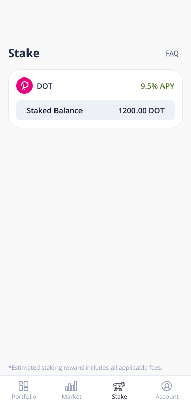
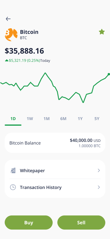
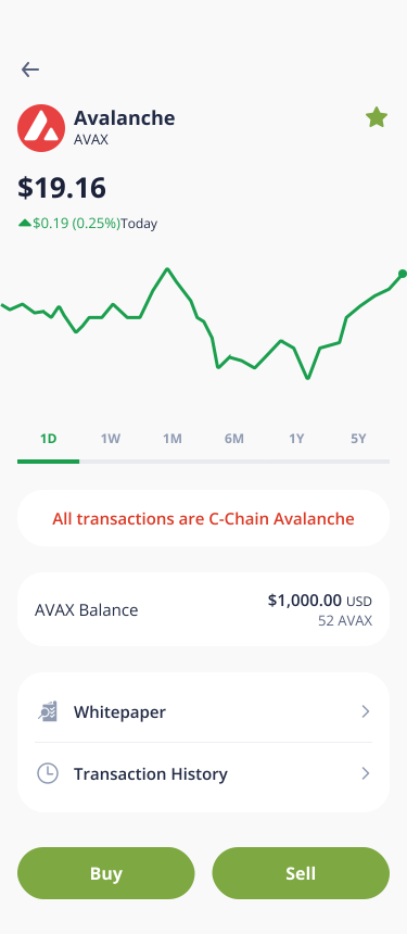
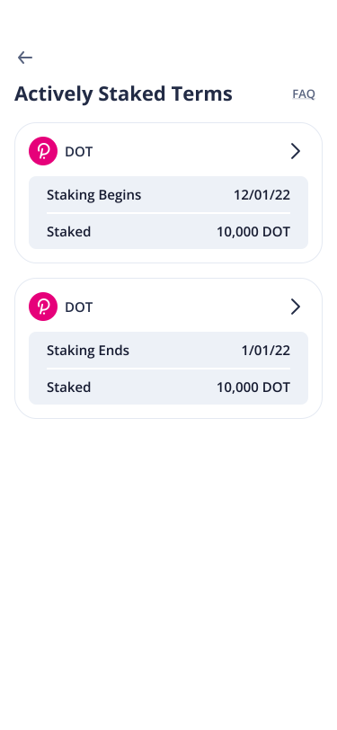
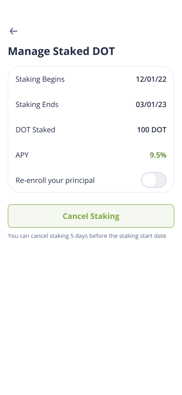
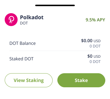
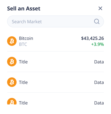
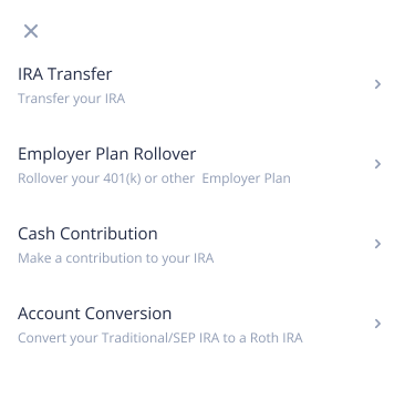
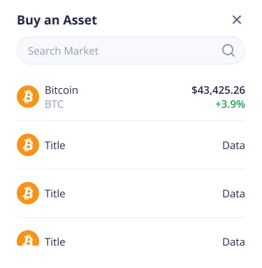
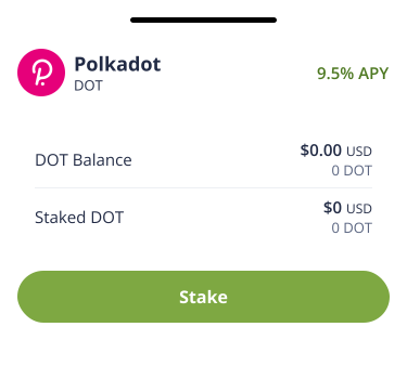
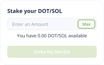
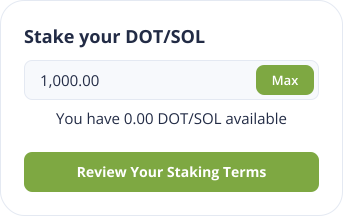
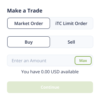
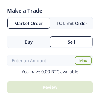
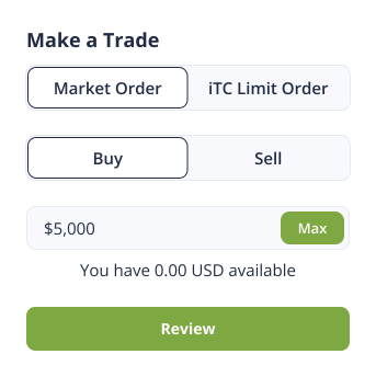
Here, I've incorporated an updated Portfolio, Market, Staking & Account tabs. Additionally we have updated asset pages, trading & staking interfaces, and additional overlays that ease user cognitive load & greatly reduces the total number of clicks to perform every major action.





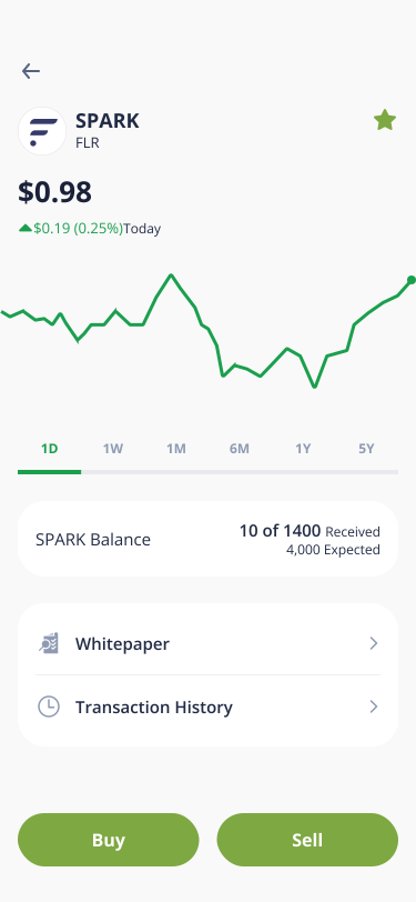
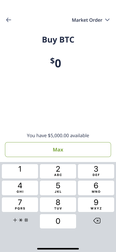
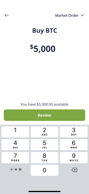
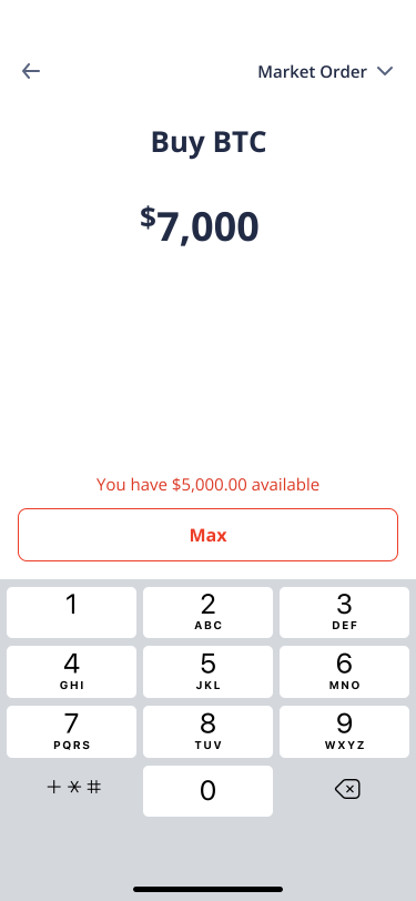
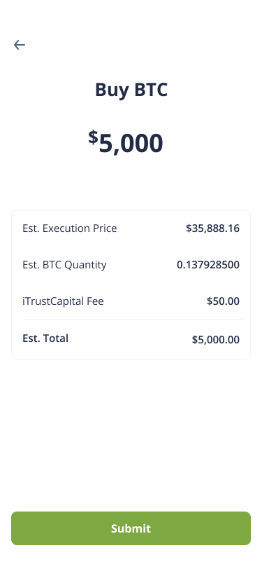


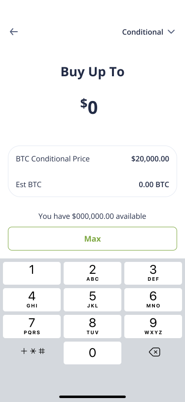
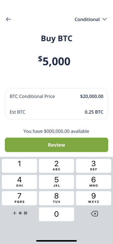


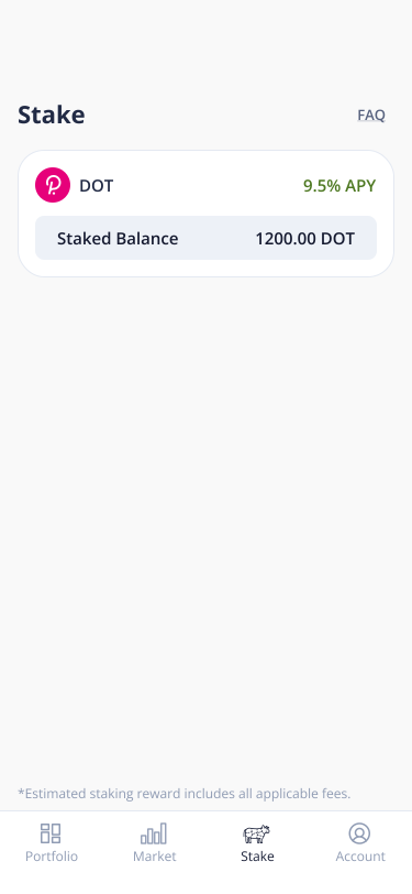


Web
Here, we have an entirely new web experience. The navigation has been moved to the top, this allows users to access the 4 primary screens, while they can also change their account, contact support & add funds from virtually any screen.


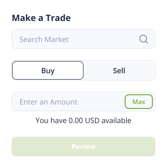
Web Trading Interface
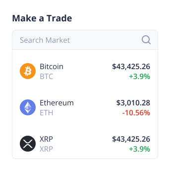
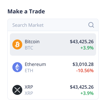
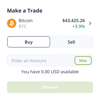
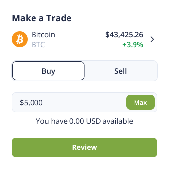
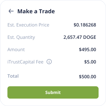
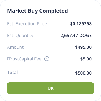
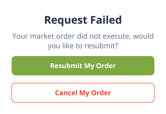
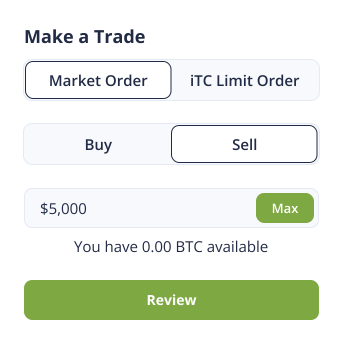
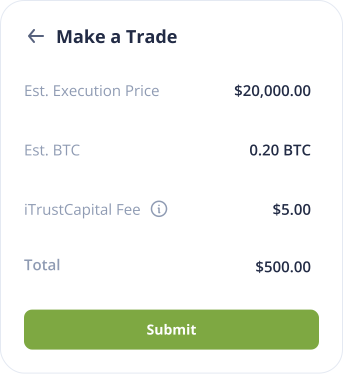
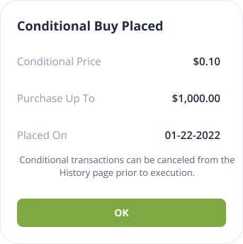
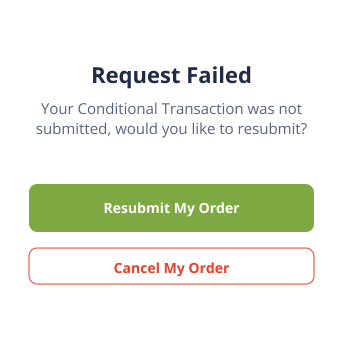
0 - 1 build of a new web trading interface, allowing users to trade from almost every screen, minimizing steps to achieving their goals and creating additional exposure to multiple revenue generating verticals.


branding
The current green (7EA842) is not ADA compliant, after some research and collaboration with our in house creative team, I settled on a dark blue (1A2038). This color is reminiscent of space exploration & the stars, a frequent thematic element in the crypto industry.
reflection
By collaborating with our analytics, marketing, CX & operations teams I was able to create an entirely new mobile & web experience that alleviated persistent user pain points & rejuvenated the online iTC experience & brand. This was a wonderful project to work on and am extremely excited to work on more large scale design overhauls.